Popups — the court jester of the web. They appear out of nowhere, stick around when you want them gone, and they’re always asking for your email!
Neither jesters nor popups are inherently evil, but there’s a time and place for both. Popups allow you to stack content over a page without making the user navigate away from the page they’re on. They provide space to get information directly in front of your customer’s eyes. Want someone to subscribe to your newsletter or hear about your upcoming event? Popups are great at that.
And, popups are easy-as-parcheesi to implement — regardless of who developed your site and what tools they used to build it. You can implement systems like chatbots or schedulers in non-invasive ways that aren’t constrained to your website developer’s skillset. No design change required. No extra coding.
So, slap a party hat on your site and boom, more leads . . . right?
Not quite . . . you might be making your site abysmal to use and tarnishing your company’s long-term brand perception.
Welcome to Popup Prison
You threw a third-party script on your site because someone promised $$$.
All you got was a couple pre-agitated leads that had to close your popup 12 times (!!!) while navigating your site.
How’d you get here?
Your shiny new tool might’ve done one of the following:
- Your popup opened within seconds of the user landing on the page
- There’s no exit button . . . or it’s so itty bitty the user has to hold their breath to click it properly
- Your popup goes BA-DA-DING every time the user loads a page
- Your site looks like a nightmare in Times Square with multiple popups stacking on top of each other
- Your popup was so ginormous it blocked out the sun
- Your chatbot auto-opened, soullessly screaming “I’m Sherice, your AI Assistant. How can I help? ”
- Your popup doesn’t remember it was closed, so it keeps coming back and the user keeps closing it. 2006 style!
Ask Your Popup: Are You Helping or Hijacking?
Website visitors feel tension when their current task is interrupted. If they’ve just landed on your site, they’re looking for signals they’re in the right place. Unexpected popups interrupt this process, and cause frustration and confusion.
Popups should feel like a respectful tap on the shoulder, and never a slap in the face. If your popup genuinely adds value, supports what the user is already trying to do, and respects their experience, you’re in the clear!
So When Is a Popup Okay?
- Exit Intent – The user is about to leave. A well-timed offer can feel like an invitation to stay after dinner for ice cream.
- After a Delay – The user is settled into your content. You’re only showing it once, and it’s a courteous ask.
- The User Clicked Something – When a visitor clicks a “Subscribe” or “Book Now” button, they expect a popup. Popups like this are often called modals. They get this extra special title because they’re working popups — they’re doing a job for your visitor.
Why Popups Get Abused
The trophies for “most egregious popups” generally go to third-party software. Often, popups built for software as a service (SaaS) are created with minimal customization available and must work across numerous website builders. So, you end up with a “best for all customers” option, rather than a “best for your site” installation.
This might mean colors, fonts, or styling that looks a step-cousin away from the styles on your site, and limited customization on size, and timing or trigger functions that open your popup.
Beyond that, popups built for SaaS are rarely optimized for elegant customer experience — their goal is to capture as many leads through their system as possible. Unfortunately, this means making the modal noticeable by hogging screen real estate and annoying the reader.
Voilà! An obnoxious popup with bells on its shoe tips and a bike horn in its mitts.
How to Build a Popup Your Customers Would Invite to Dinner
1. Let Your User Settle
Set a delay, wait for the user to scroll down the page, or wait for exit intent before showing your popup. A popup the user didn’t trigger is an assault on their train of thought.
2. Provide an Easy Escape
Always give the user a clear, visible way to close the popup. A highly visible “X” in the top right corner works great. In addition, users should be able to close by clicking outside the modal or pressing the escape key.
3. Remember When Your Popup’s Been Closed
Once your user closes a popup, it shouldn’t re-open, even if the user loads a different page. Use cookies to keep it closed.
4. Pretty Always Wins
Match your branding. Use subtle animation. Keep it elegant.
5. Use Clear Language
Your popup should have limited text, and all of it should be easy to understand. Use visual hierarchy to guide your readers, and avoid confusing users with passive-aggressive button text like “No, I hate saving money.”
6. Only Show One Popup at a Time
Your website visitors aren’t there to play popup whack-a-mole. If one popup opens, force any other open popups to close.
7. Keep a Lid On It
Popups that emit sound make users want to throw their devices out a window. That’s not an emotion you ever want associated with your brand. No dings. No whistles. No music.
Focus On Customer Connection, Not Quick Leads
If a popup on your website disrupts someone’s flow, you’re eroding their trust in your brand. But if it feels like a gentle nudge, like you’re offering help right when they need it? That’s a win.
Implement popups that enhance your site. Choose software that integrates well into your website in both design and user experience.
And next time someone says “just throw it in a popup,” ask:
- Will this help the user achieve their goal?
- Is the timing appropriate?
- Would I find this annoying?
If your answers check out, popup away. If not? Step away from the modal.
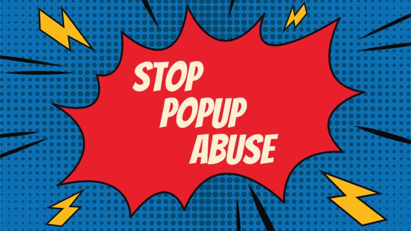
- Stop Popup Abuse: Your Customers Deserve Better - November 26, 2025