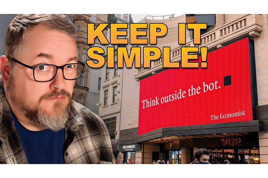
The laziest looking ads are secretly GENIUS
I can hear the words of somebody going, "But not everybody knows who The Economist is!"


When everyone’s post, flyer, or van wrap has the same AI generated feel, it becomes a problem.

This is an ad for the concept of fractional shares, which can be a difficult idea to explain.

It breaks all the rules of design, yet the company holds a sizeable chunk of market share in Australia.

“Branding experts” routinely ignore the overwhelming weight of this scientific evidence.

Reframing brings old ideas into new perspectives, which changes the way you feel about something and leads to new decisions.
You know how the Wizard of Ads is always talking about third-gravitating bodies? You can see it being used here with the colour.

The most well-known brands in the world. Coca-Cola. McDonald’s. Nike. They all have strong visual identities that are immediately recognizable.

You finally receive the design, but it just really didn’t hit the mark. That's because of a poor (or nonexistent) Creative Brief.

If you have the right artist, they make their decisions consciously and objectively for the purpose of drawing attention. And they do it using an invisible ally.


