I saw the following posted as a bit of humor online and thought it contained a powerful advertising lesson:
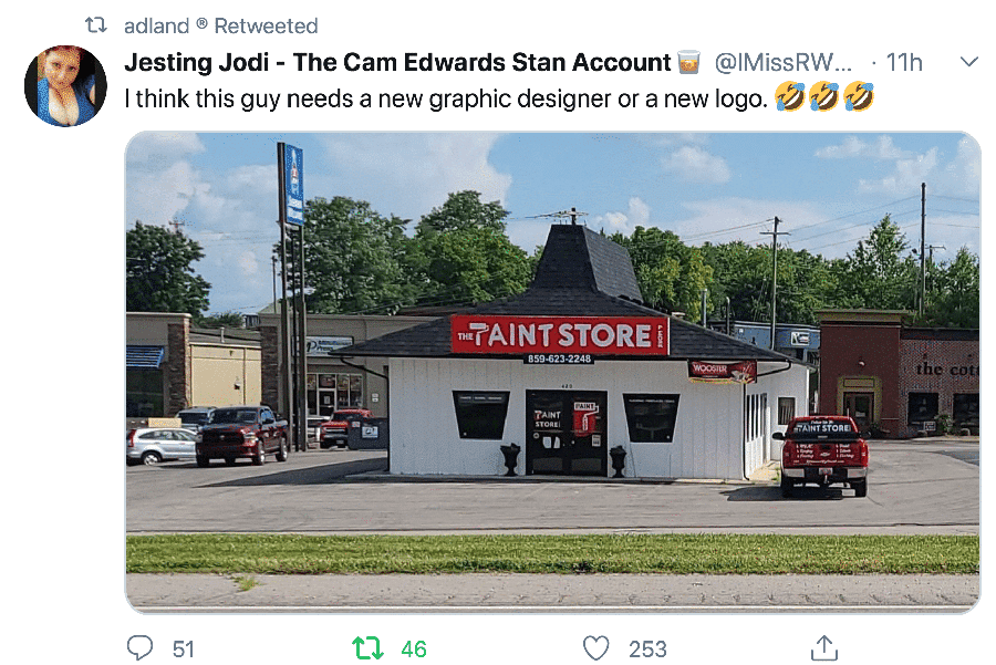
I’m sure that the design for this sign looked excellent when presented up close.
The more you zoom in, the more the paint roller looks enough like a “P” to make it work.
But when viewed from the roadside, it looks like the “T’aint” store, doesn’t it?
Now, that’s sort of rare for store signs, but it’s par for the course on billboards, where the signs are viewed up close and static on a computer screen, rather than in passing from a car that’s half a football field away.
That’s why you see signs with too many words and complicated, detail-driven designs that look like this:
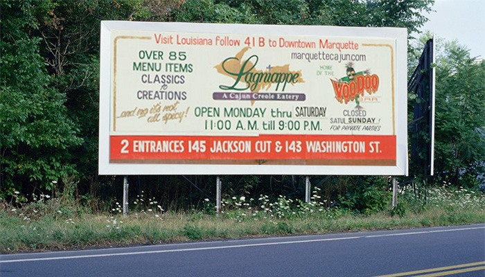
As opposed to a bold, simple, and unified design that works.
What About Radio Ads?
Would it surprise you to learn the same thing can happen with radio ads?
Ads that can sound fantastic in a quiet office can sound muffled or muted in a car with road noise as background.
And ads that sound too “dry” in an office, with no or muted music and a dramatic read, can actually jump out of the radio when heard immediately after a typical “Yell and Sell” radio ad.
The point is this:
It pays to try to evaluate your ads in the same context they’ll be experienced in.
- Make that billboard design smaller and stand back from the monitor.
- Take the radio ad into the car with you and listen to it off of your smart phone, maybe even through your car’s speakers.
- See if your TV ad still hits if you just hear it while your back is turned to get something out of the fridge.
- Spend some time listening or watching the channels you’re advertising on to see what the other ads sound like, to either ensure you’re zigging when they zag, or to ensure you’re not coming off as if you’re from “out of town.”
Because however people end up encountering your ads, it is unlikely it’ll be on a computer, while sitting in a quiet office, and giving it their full attention.
And if your ad guy isn’t doing this for you, it’s probably time for a new ad guy.
- Getting a Foot in the Door — Of Perception - November 27, 2025
- What Digital Superstars Know About Offline Advertising - November 17, 2025
- Unmistakable: A Tale of Two Boots and Branding Done Right - November 8, 2025