Announcer 1: It’s second period with 10 seconds left on the clock. The puck’s in the bottom right of the defending zone. Schwartz and Tavares are fighting for possession.
Announcer 2: Schwartz manages to get his stick on it and pass the puck where McCann is waiting for it in the neutral zone.
A1: He’s alone! McCann is driving it down the ice and towards the attacker’s zone.
A2: The goalie has no defense! His teammates are rushing to reach him.
A1: 1 second left! McCann takes his shot! HE SCORES!!!
A2: A beautiful pass by Schwartz to McCann in such a tight spot.
Those are the types of plays that make the Kraken a strong team. They stay focused in a pinch, and their players are in a position to score when the other team least expects it.
A1: I’ll tell you what, the goalie wasn’t expecting it either. He just caught a flash of that Kraken eye and next thing he knows, the puck’s gone past right him.
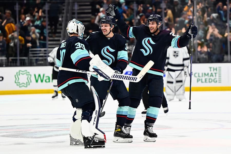
![]() The Seattle Kraken is a new hockey team that entered the NHL in 2021—2022 season, and they are my favourite team for 3 reasons.
The Seattle Kraken is a new hockey team that entered the NHL in 2021—2022 season, and they are my favourite team for 3 reasons.
- They are a brand new team with a clean slate and zero history, which leaves room for potential and no team history to read up on and has lots of room for newcomers to the sport. (Like myself).
- They are a brand new team which means they’re the underdogs, and I love a good underdog story. (I’m an underdog myself, which gives me more reason to love’ em).
- They have the best visual brand and colour scheme in the league.
I am going to talk about the third reason. The Kraken visual branding is gorgeous, from the logo to the colours. (Whoever designed the logo, I want to kiss you on the lips.) They played with the concept with such form and grace. When I look at the logo, I know it is alive. But what if I told you that what makes the team brand and logo so great boils down to the colours that they’ve chosen? This is called Colour theory.
Colour Theory is very complex. But an important point you need to understand is that Colour Theory is about the relationship between colours and not actually about the individual colours themselves. Let’s take a look at the colour wheel.
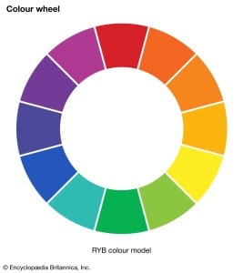
Here you’ll see the standard primary colours. Red, Blue, Yellow. As well as the secondary colours Green, Purple Orange. The colours you can find in the rainbow. And then everything in between. The colour wheel is a crucial tool in understanding the relationships between colours.
For example, what’s the opposite of Purple? You can find the answer by looking at the colour directly opposite of Purple on the wheel. The colour opposite of Purple is Yellow. You can apply this to the other colours as well. Colour opposites are called complementary colours, and with this combination, you can create colour schemes that “pop,” create emphasis, and accent/disrupt the colour scheme. Now, look at the Kraken Logo with the colour wheel next to it. What do you notice?
![]()
You know how the Wizard of Ads is always talking about third-gravitating bodies? You can see it being used here with the colour. The logo mainly uses a blue-green colour and harbours a small bit of red in the corner of the “S’s” spine. The Kraken’s eye stands out and becomes the third gravitating body amongst the blue-green. It’s the little accent that complements and brings the colours to life. No other teams use a colour scheme like this. They only use obnoxiously loud saturated colours that lack the subtlety they need to make their brand come to life. It was this deep understanding of colour that made Monet create such life-filled paintings. Long story short, the Kraken’s brand colours are akin to Monet’s use of colour, and that’s why they have the best colours in the league. Now that you know what complementary colours are keep your eyes open for any examples of it being used in the real world. Like billboards, packaging and logos.
![]() As a bonus, I want to briefly touch on the other side of the coin, which is; Who has the worst colours in the league? My answer is the Las Vegas Golden Knights. The Golden Knights have a combination of “gold” and black, and it makes me gag. When you think about it, the colours make sense. “It’s Vegas!” But when you look at their colours from far away or squint your eyes, the colours blend and meld into an unrecognizable muddy mess. What could that possibly represent? What happens in Vegas, stays in Vegas? Losing your life savings to the slots? The brown of coming back home to ordinary? Here’s the thing, gold and black are not a terrible combo. Normally the sheen and lustre of gold prevent the colours from mixing into dirt. When you use actual gold you actually get a variety of colours depending on the type of gold, ranging from amber to green. The problem with the GK’s gold is that it’s not actually gold. It’s a Fool’s Gold; a dank yellow that is meant to resemble gold. The lack-lustre colour is the reason why the colours fall short. You can’t fake luxury. You either look it, or you don’t. And the GK’s don’t.
As a bonus, I want to briefly touch on the other side of the coin, which is; Who has the worst colours in the league? My answer is the Las Vegas Golden Knights. The Golden Knights have a combination of “gold” and black, and it makes me gag. When you think about it, the colours make sense. “It’s Vegas!” But when you look at their colours from far away or squint your eyes, the colours blend and meld into an unrecognizable muddy mess. What could that possibly represent? What happens in Vegas, stays in Vegas? Losing your life savings to the slots? The brown of coming back home to ordinary? Here’s the thing, gold and black are not a terrible combo. Normally the sheen and lustre of gold prevent the colours from mixing into dirt. When you use actual gold you actually get a variety of colours depending on the type of gold, ranging from amber to green. The problem with the GK’s gold is that it’s not actually gold. It’s a Fool’s Gold; a dank yellow that is meant to resemble gold. The lack-lustre colour is the reason why the colours fall short. You can’t fake luxury. You either look it, or you don’t. And the GK’s don’t.
If you’re still unconvinced, I have a task for you. Pull up the colour wheel and find the two colours. Can’t find it? Like I said earlier, actual gold is a variety of colours. Which means gold itself is not a colour. It’s the spectrum of colours and their harmonious relationship that makes gold look like gold. As soon as you mix those colours you will end up with that Fool’s Gold colour.
The power you wield when you have a clear understanding of colour relationships is immense. It’s easy to use but difficult to master. But with this, you should be able to accomplish enough to make a difference in your business. Hey listen, I’m gonna have to catch you later the 3rd period is about to start, and I don’t want to miss it.
A1: Welcome to the 3rd period. We hope you grabbed another cold one during the break.
A2: the Kraken are on fire tonight!…
- Love Letter to the Forgotten: Intimacy of Analog - January 1, 2024
- I Hate a Roman Named Status Quo! - December 6, 2023
- Vincent Van Gogh, Torture of Belief. - April 21, 2023