Did you know that there are 12 kinds of Ads?
Granted, this model is geared towards TV ads, but, yes, according to Donald Gunn, a former creative director at the legendary Leo Burnett agency, there are only 12 kinds of ads.
I’m not going to go into them here, since you can read all about Gunn’s categories over at LifeIsMarketing.com, but I am going to give you an alternate framework for thinking about ads.
So what’s the framework?
It’s the same Framework that’s been made famous — or, at least more famous — by its mention by the Heath Brothers in the opening chapters of their justly famous book, Made to Stick, wherein they mention an Israeli research paper, “The Fundamental Templates of Quality Ads.” According to the published research, 89% of award-winning ads could be classified into 6 basic templates.
More importantly, providing amateurs with just 2 hours of training on the use of these templates boosted their abilities to produce ads that positively affected audience perception of the advertised products by 55%
And now I’m going to break those templates down for you
Just keep in mind that, again, these templates were discovered while researching award winning ads, not necessarily sales increasing and market-share winning ads. But for what it’s worth, here are the templates, complete with handy-dandy examples:
Template 1: Pictorial Analogy
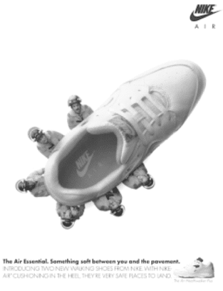 In technical terms, this type of ad creates a dramatic situation and then makes a substitution between the product and another item with symbolic significance in order to illustrate the value or worth of the product. The idea is to create an unexpected or surprising explanation of the value of the product through visual metaphor.
If that’s hard to follow, just look at the Nike example to the right.
In the ad, you are introduced into a dramatic situation of having to jump from a burning building only to find that the firefighters’ safety net/trampoline — an item with huge symbolic value — has been swapped for a Nike air shoe.
This pictorial analogy creatively illustrates the protective and cushioning function of Nike Air technology and is reinforced by the ad copy which calls the air technology, “Something soft between you and the pavement.”
Template 2: Extreme Situation
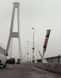 This template shows a product performing beyond the limits of normal use in order to exaggerate a key attribute or worth.
This may seem similar to the pictorial analogy, but it’s different because it requires no use of symbolism or analogy — it’s more straightforward in its extremity. The Cleve outdoor ad for the superglue isn’t trying to make a visual pun, it’s just showing the glue used in an exaggerated extreme.
The same can be said for this ad for WMF knives:

Template 3: Extreme Consequences
This template shows the exaggerated results of either using the product or the exaggerated consequences of not using it. This Listerine ad shows the extreme consequences of NOT using their mouthwash.

While this ad for Wonderbra indirectly shows an extreme consequence from using their product:

Template 4: Competition
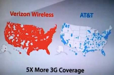
As the name indicates, this template shows the product in direct comparison with either competing products or exaggerated alternatives. This Verizon ad is about as straightforward a competition ad as you can get:
While this Land Rover ad is a bit more indirect, both in its execution and in what it sees as the product’s real competition : )

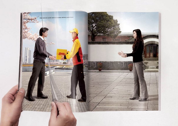
Template 5: Interactive Experiment
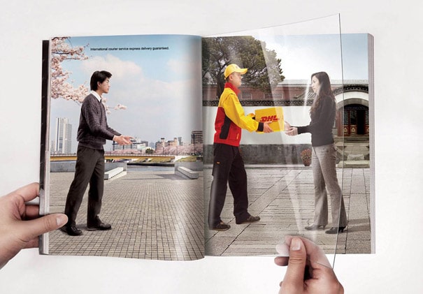
Yes, boys and girls, non-internet ads can be interactive. And, no, that doesn’t require the use of QR codes and such. Just take a look at this great ad for DHL:
Template 6: Dimensionality Alteration
This is where you show some attribute of the product or service by altering the environment. A classic example is this old-school headline for a faster cruise ship:
“Starting next Tuesday, the Atlantic ocean becomes only one-fifth as long”
But my favorite example of this isn’t an ad at all, but a quote from Billy Wilders immortal, Sunset Boulevard:
“You’re Norma Desmond. You used to be in silent pictures; you used to be big”
“I still am big — it’s the pictures that got small.”
Here’s what it looks like in a print ad that compresses time to show consequences:

And that’s a quick and dirty breakdown of the ad templates. Hope you find ‘em useful.
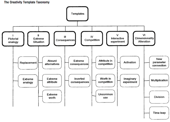
P.S. if you’re interested, most of these 6 categories include sub-categories, that you can read about in the original research. But for those too lazy to do that, here’s a quick and dirty chart showing all the sub-categories:
- Getting a Foot in the Door — Of Perception - November 27, 2025
- What Digital Superstars Know About Offline Advertising - November 17, 2025
- Unmistakable: A Tale of Two Boots and Branding Done Right - November 8, 2025
