 You, my friend, are hardwired to find meaning; you can not help but connect the dots.
Case in point, the triangle to the right doesn’t exist. The only shapes in that picture are three black pac-man shapes.
Yeah, the negative space left by those Pacman shapes include wedges of white — but the larger triangle that you see connecting those wedges of white into a meaningful pattern only exists in your mind.
And yet, if the Pacmans are there, you can’t help but see that triangle, can you?
In fact, the only way to not see the triangle is to remove two of the Pacman figures, ’cause as long as the dots are there, you WILL connect them.
Designers refer to this as “closure,” and it’s more than just a parlor trick or visual illusion.
Closure and Image-Text Interaction
Closure, as it turns out, not only comes into play between elements within a picture, but also between image and text. And this interplay was especially on display in a recent post by the always-interesting Derek Halpern (h/t Melissa Breau)
Halpern references recent psychological studies showing that statements accompanied by related images are considered more believable than the same statement without an image. So, a statement like “The liquid inside a thermometer is magnesium” was more frequently rated as true when it was accompanied by a picture of a thermometer!
Similarly, statements about whether some obscure “celebrity” was alive or dead were also more frequently rated as true when the statement was accompanied by a picture of the celebrity. And this effect was the same regardless of whether the pictured celebrity was pronounced dead or still living.
Clearly, pictures have persuasive power beyond what anyone has ever suspected.
And just knowing this is incredibly useful, but in my opinion, the real meat of these studies comes from asking WHY. Fortunately, one of the posts that Derek links to nicely summarizes the hypothesis formed by the scientists who conducted these tests [emphasis mine]:
“The reason for the difference lies in the suspected mechanism at work. The “truthiness” researchers (Newman et al., 2012) speculate that a not necessarily probative but relevant image, like the tire slide above, increases the “cognitive availability” of the concept. That means the mind finds it easier to think about and elaborate on the concept. In the process, that makes the claim seem more familiar which in turn makes it feel more true: “Truthiness” achieved.
There are also other mechanisms that facilitate elaboration. For example, the researchers refer to the notion of a “semantically predictive sentence,” which means phrasing that leads a listener to anticipate what the upcoming words will be. For example, “the stormy seas tossed the boat” is more semantically predictive than “he saved up his money and bought a boat.” That expectation causes a listener to feel more familiarity and translate that into greater veracity (Whittlesea, 1993). When people are engaged — by anticipating the final word in this case — they engage in more fluent processing and that leads to a feeling of truth.
That process extends past the role of imagery. In Newman and associates’ second experiment, they showed that including non-probative words instead of a photo produced the same effect (e.g. accompanying a political leader’s name with information about ethnicity, sex, hair color, etc. — factors that create a picture in the mind, but without telling the reader whether the figure is alive or dead). The additional information led people to believe that the associated claim was more likely to be true.”
Ok, so first thing, what the heck does non-probative mean? Basically, it means the photo does not logically prove the statement to be true or false. Non-probative images are merely decorative.
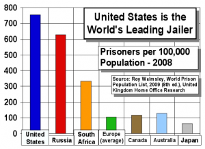
For instance, if you have a statement like “The US has the highest incarceration rate of any country” and you then accompany that statement with a bar graph like the one on the right, then that image would be considered “probative” because it would logically “prove” the statement to be true, assuming that you took the image at “face value.”
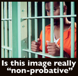
This is opposed to a more decorative image of a convict behind bars. That photo would be related to the statement about incarceration rates, but it would not logically “prove” anything.
Why “Non-Probative” Doesn’t Mean Non-Persuasive
 Although a non-probative photograph may not “prove” anything, it can still suggest and imply.
So who says suggestion is any less persuasive than outright statement?
For instance, if that photo of the convict behind bars was black, it might remind the test subject that the US jails a disproportionate number of African Americans — a visual suggestion that would surely color one’s judgement of the accompanying statement, right?
Because people can’t help but connect the dots between image and statement.
It works the same way with the celebrity statements as well. because we believe in internal consistency. If someone hands us a statement with spelling and grammatical errors, we become less likely to lend credibility to the statement or the person who wrote it. Anyone recall Dan Quayle’s Potato gaff?
So when someone mentions a little known celebrity and provides a picture of said celebrity, we not only automatically connect the dots between picture and celebrity, but we connect the dots between knowing who the heck one is talking about with knowing what the heck one is talking about. The thought process goes something like, you obviously know who this guy is and I don’t, so you probably also know whether or not he’s still alive…
Why do I think this is a greater factor than the psychologists’ “increased cognitive availability” hypothesis?
Because scientists who conducted the same test, but who accompanied the celebrity statements with facts and stats about the celebrity instead of a picture recorded the same effect: the stats boosted the perceived credibility exactly as the photos did in the previous test. And my guess is that the stats “prove” to the test subjects that the people making the statement really know who they’re talking about, in pretty much the same way that a picture would. Makes sense right?
But would stats really help people hold an idea in their heads? Would stats make the celebrity more “cognitively available” to the test subjects? I rather doubt it.
 So it’s really less about helping people hold the idea in their heads, and more about subtly convincing them you know what you’re talking about.
And images don’t have to do that explicitly, as implication and closure work just fine, if not even better.
A picture of an old-fashioned thermometer displays a silvery strip in the middle of it, implying the idea of liquid metal. Connecting the dots between image and statement, and suddenly the idea of liquid magnesium seems a whole lot more plausible…
It makes me wonder if a picture of a modern-day thermometer would have had the same results…
Using Closure To Improve Persuasion & Impact
So… we know this closure between image and text creates greater believability. But how would one use it for images alone?
Well, for images, the short answer is to give the viewer 2 + 2 rather than just handing them 4. Create an image that makes them connect the dots between elements of the image. Here are some great examples of that:
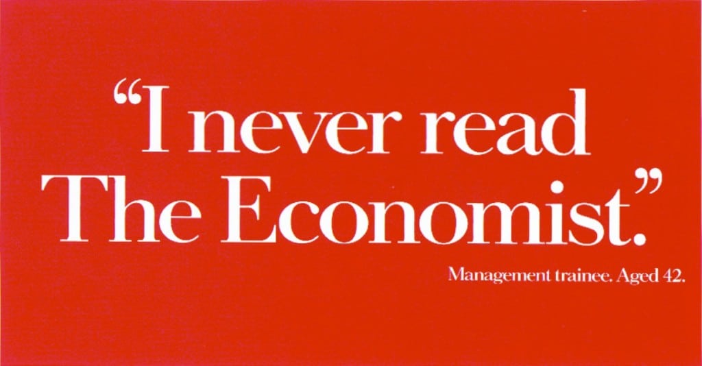
OK, so these are cheating a bit because they’re both text-based images, but neither of them make much sense until you connect the dots — allowing both ads to make their statements all the more strongly.
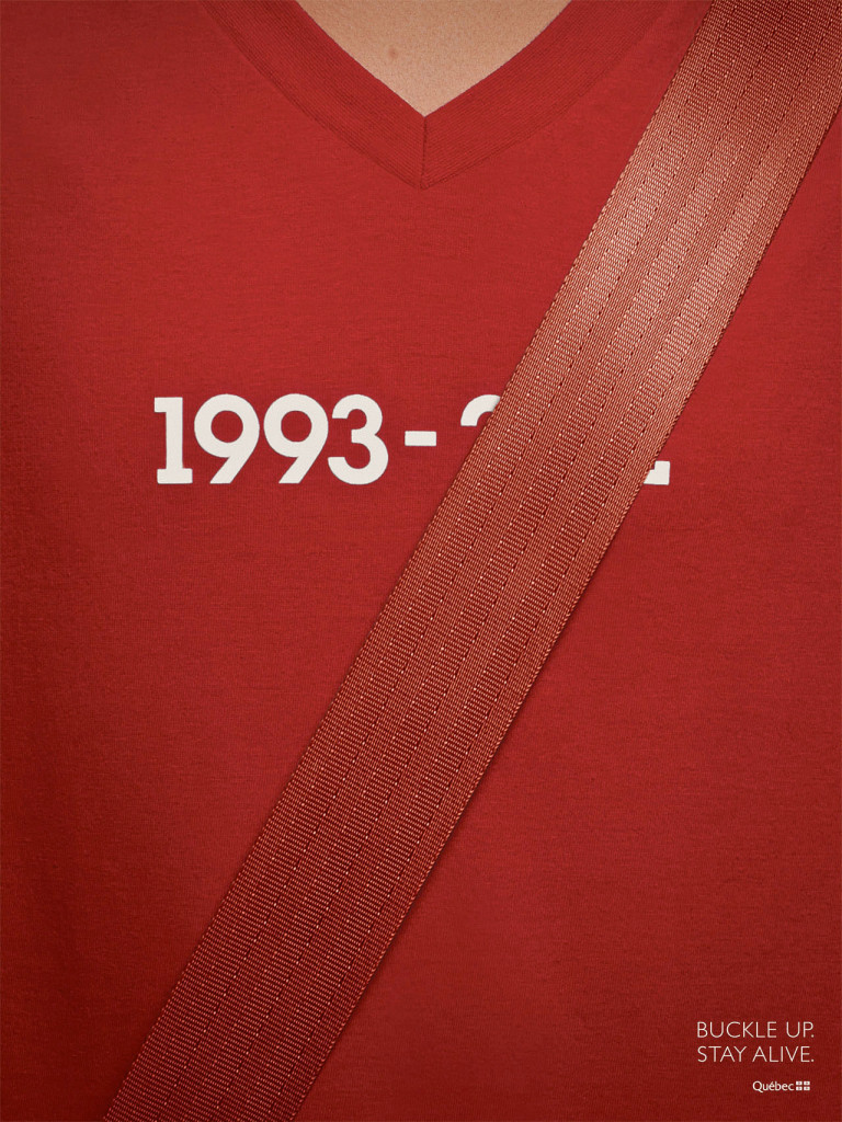
Here’s another example, this time with an honest, no-kidding image:
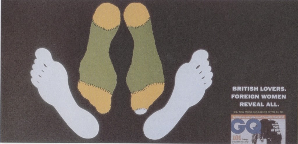
Again, the image is meaningless until you mentally “fill the gap” about what those sets of feet really indicate. Closure at work. There’s also a nice gap/connection between the stockinged feet and the text.
And on a more purely visual note, much of the emotional impact of this image can be attributed to the “gaps” that it forces your mind to fill in:
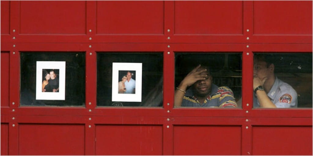
Great example of closure used to increase mental engagement and impact. But what about using closure to select more powerful imagery to accompany your persuasive copy and messaging?
How to Use This In Web Copy
Here’s what I suggest:
1. Use the “I saw it with my own eyes, so it must be real” approach
If you’ve got a testimonial, you could, as Derek suggests, place a picture of the customer who gave it to you next to the testimonial. That’ll work. Or, if you don’t have that, you could take a photo of the hand-written testimonial and place it next to the testimonial.
It sounds silly, but just imagine the difference between someone saying “this person wrote in to say X” and someone handing you the actual hand-written note and saying “look what customer X had to say.” Which would be more persuasive? The latter, right? Because then you could say that you saw the testimonial “with your own eyes.”
Of course, the “so it must be true” part would likely go unsaid, but it would be all the more powerful for it. And that’s why an image of the hand-written testimonial would be more persuasive than the statement alone.
So within your sales copy, determine which elements people would most want to see with their own eyes, then find images that would give them a similar sense of verification.
Another example, I once worked with a metal roofing company that claimed a no-kidding 50-year life span on their roofs. Now the claim and guarantee is great. But what I advised them to do was find the oldest roof they had ever installed (which turned out to be 30+ years old) and to get both an establishing pic of the building/roof and a close-up picture of the metal “tiles.” It’s one thing to claim a 50-year life span, and another entirely to show a 30-year roof that looks brand new.
Just don’t do the cheese-ball thing of using blacked out bank statements to “prove” how much money you make!
2. Use images to suggest and emotionally prime belief
No one does this better than apple. Take a look at this screen shot from Apple’s page on the iPad:
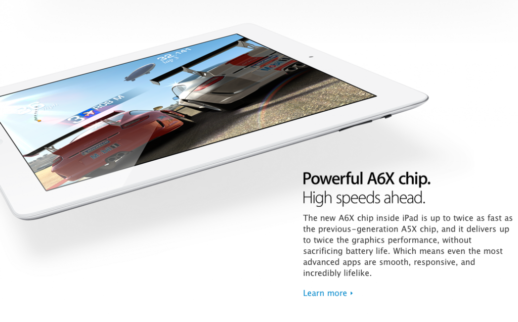
It’s not an accident that the iPad sports an image of two Porsche’s about to race, or that the image is from a graphics intensive game. The messaging is about speed after all. Speed achieved through high-performance engineering. Don’t you think the image of “Porsche Race Cars” brings all that to mind rather powerfully?
Here’s another example:
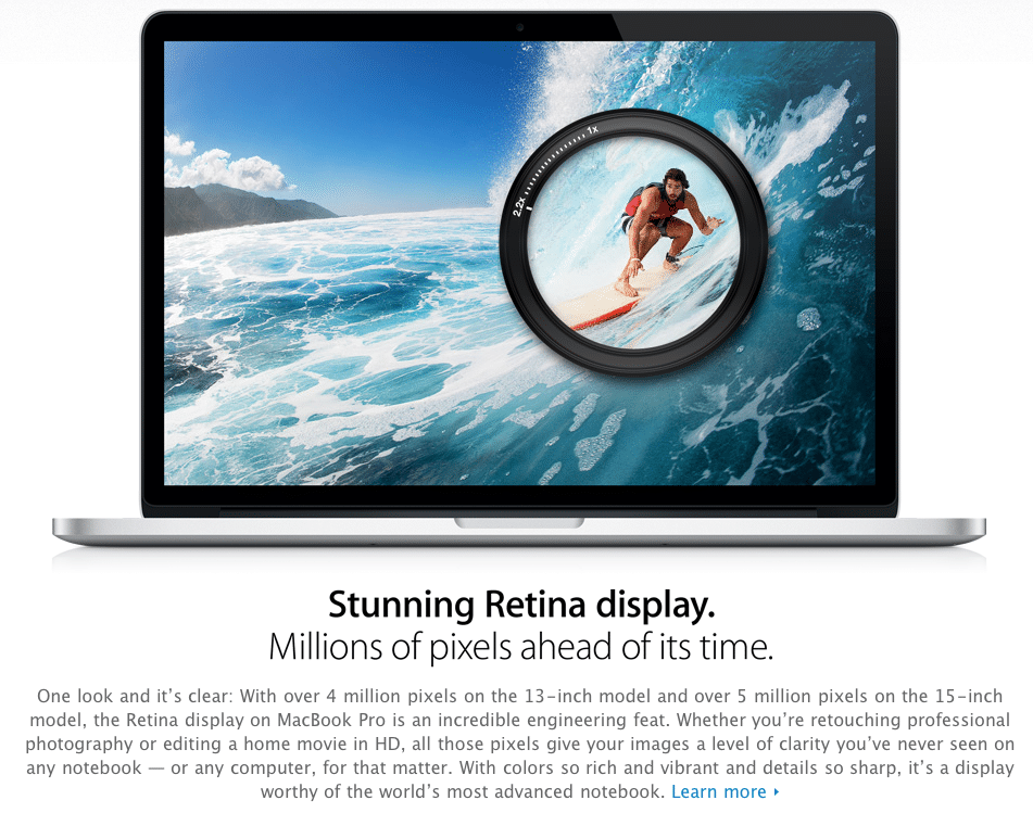
So… what the heck is that black ring in the middle of the picture?
It’s not a magnifying glass. Nor is it a camera lens, is it? Maybe it’s some kind of weird bastard love child between the two…
But it doesn’t matter, does it. We instinctively know that this is showing us that even when you magnify the picture 2.5X, it’s still high-res enough to look crisp and un-pixelated. Of course, the copy never makes that claim. But the picture certainly suggests it, doesn’t it?
If Images Combined with Statements Are Powerful, What About Video?
But were this really starts to come into it’s own is in explanatory videos. But that’s a subject for another post…
- Are You Paying for Too Much for the Wrong Keywords? - July 15, 2024
- Dominate Your Market Like Rolex — 4 Powerful Branding Lessons - July 3, 2024
- Military-Grade Persuasion for Your Branding - June 25, 2024