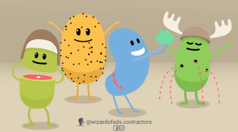
Is your business in a boring industry? Do you think there’s nothing inherently interesting, captivating, engaging, or funny about your business? Are all the ads in your industry carbon copies of each other?
Jealous because you have a YUGE opportunity to stand out. The truth is that no matter how boring you think something is, there’s ALWAYS a way to make it funny. You just have to find the joke.
Let’s use trains as an example. On first glance, there’s nothing overtly funny about trains. Now, what about safety? BORING. An ad about train safety? Ugh, kill me.
Yet, this ad about train safety has hundreds of millions of views, and was the most shared video of 2012. (And the song is catchy. I dare you to slip it into a playlist just to see if your buddies catch on that it’s… abnormal.)
Why was this ad so effective?
Juxtaposition.
Juxtaposition is a combination of contrasting ideas. We smash together elements that don’t belong, and the sum creates a third element which reveals a new perspective, a twist, a different angle, or a surprise. And that’s where the joke is found.
Melbourne Metro deserves a standing-O for letting their people run with this incongruous combo of concepts:
- They fuse morbid lyrics with a sweet melody and adorable visuals.
- It provides a way to talk about death that isn’t depressing or dramatic.
- Whimsical animation gives the ad permission to talk about horrible things. it also gives the audience permission to laugh at dark humor without feeling guilty (because cartoons aren’t real!)
- The situations in which these characters die are highly unexpected, stupid, and exaggerated. Remember how popular the Darwin Awards were? This ad uses the same concept.
A common juxtaposition technique is to combine light and dark elements:
Pleasant music (light) + macabre lyrics (dark) + cute animation (light) + violent death (dark) = friggin’ art.
The incongruous combo of adorable and horrifying creates a third concept:
Adorable + Horrifying = Adorrifying.
Juxtaposition and incongruity are tools of misdirection. The first three seconds of the ad are sweet. Then comes the dark twist. Misdirection = surprise. And surprise is the foundation of humor. We laugh because we’re surprised.
That which surprises us is memorable, because science.
Surprise forces our brains to focus in order to process what just happened. You want people to focus on your ad? Surprise them. The caveat is that the surprise has to be relevant to the message. If it isn’t connected to the core idea, it won’t have impact. (Melbourne Metro’s ad connects all the dumb ways to die with ways that people have died by not following their safety protocols.)
According to Dr. Emrah Düzel at the UCL Institute of Cognitive Neuroscience, “When we see something new, we see it has a potential for rewarding us in some way. This potential that lies in new things motivates us to explore our environment for rewards. The brain learns that the stimulus, once familiar, has no reward associated with it and so it loses its potential. For this reason, only completely new objects activate the midbrain area and increase our levels of dopamine.”
Check out this interesting TEDx talk on surprise by Tania Luna: “Surprise hijacks all of our mental processes and pulls our focus into one thing.”
Study upon study shows us that novelty improves memory. Harvard Business Review says, “surprise is like crack for your brain.” When we experience a pleasant surprise, it revs our emotions up 400%. We literally get a chemical high from the dopamine release. Surprise also releases the neurotransmitter noradrenaline, which is linked to alertness and intense concentration.
Do you want your ads to inspire intense focus? To delight and surprise? To be memorable? You can trigger all of these positive emotions by using juxtaposition.
What I’m really trying to say is, funny ads are better.
Want more ways to write funny ads? Check out Parody!
- Want your ads to get noticed? Deny a common truth. - February 27, 2025
- Putting Funny Ads To Work For Your Boring-Ass Business – Pattern Interrupt - February 10, 2022
- Putting Funny Ads To Work For Your Boring-Ass Business – Ordinary to Extraordinary - November 30, 2021
