Advertising creatives and graphic designers groan at a client request to “make the logo bigger.”
And both the request and the reaction are entirely understandable.
The client paid for the logo and the ad. He wants to put the logo to good use, while ensuring that customers KNOW whose ad they’re looking at.
Plus — to be fair — more than a few designers over-shrink the logo in the name of “clean design.”
On the other hand, the ad pros know that an ad that doesn’t establish interest and relevance for the customer will end up an ignored and ineffective ad.
Having a logo-dominated ad just announces to the customer that they’re looking at an ad — at something that can and should be ignored.
So how do you satisfy both parties?
You make the logo an essential part of the ad while also relegating it to a small part of the background.
Something the customer needs to make sense of the ad, so it can be small graphically, but “big” psychologically.
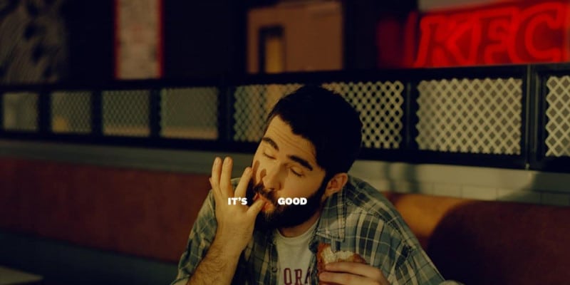
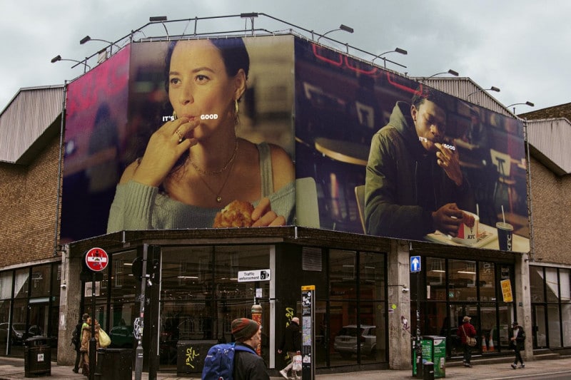
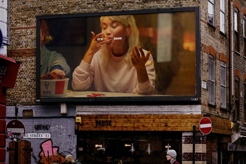
Confused? Take a look at these ads for KFC:


Now that’s a solution everyone can get behind.
It’s also a spectacular example of frameline magnetism.
Often times in advertising, the creative solution is the best solution.
Just make sure your ad pro is directing his creativity to solving problems rather than showing off.
Does your ad guy come up with solutions like this? If not, I’d be happy to help.
- Getting a Foot in the Door — Of Perception - November 27, 2025
- What Digital Superstars Know About Offline Advertising - November 17, 2025
- Unmistakable: A Tale of Two Boots and Branding Done Right - November 8, 2025
