How bizarre is the most bizarre brand mascot of the last twenty years?
Freakishly surreal and batshit crazy.
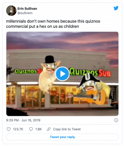
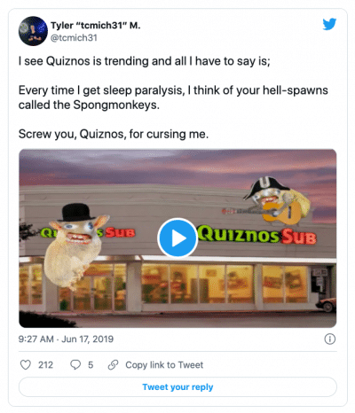
So much so that it permanently impressed itself on the tender psyches of millennials who encountered them on TV, such that they’ll still whine about it decades later.
And that’s not my opinion — that’s the opinion of the millennials.
But why bother describing them when you can see for yourself:
Yup. Back in 2004, Quiznos launched a new ad campaign featuring the “Spongemonkeys.”
And it worked. Mostly.
Spongemonkeys — Love ‘Em or Hate ‘Em, They Did The Job
 Of course, the ads were more polarizing in 2004 than circa 2022 politics, but they did achieve exactly what the restaurant claimed they wanted.
Quiznos launched the campaign to gain attention, and that it most certainly did.
As a challenger brand with a much smaller budget, Quiznos had to pit balls against budget, so to speak.
So their advertising team at the Martin Agency took that brief to heart and tracked down something disruptive and attention-grabbing enough to do the job.
And to their infinite credit, the Spongemonkey mascots not only put the business onto the radar of the general public, but they also made Quiznos synonymous with “toasted” and “pepper bar.”
In other words, they differentiated Quiznos from Subway. And in a way that stuck in the heads of the public for almost two decades after a very brief appearance back in 2004.
Not too shabby.
There’s an advertising lesson there to be explored in just a minute.
One Overlooked Way to Sell Bizarrely Creative Ad Campaigns
 But first, how in the wide, wide world of sports did the Martin Agency possibly manage to sell this idea to the client?
Because that’s where the real persuasive lesson resides.
Answer: they didn’t show the client the spongemonkeys; they showed the client a film of college students watching the spongemonkeys.
When the Quiznos CMO saw a huge group of his target demographic literally falling out of their chairs laughing at an (unseen) film clip, he was hooked.
It’s a similar technique to how Jimmy Kimmel managed to convince his audience to go see The Brothers Grimsby without actually showing any clip from the movie:
So you can imagine how the Quiznos CMO had to see for himself what the audience found so hilariously fascinating.
And it was this Spongemonkey’s clip you can watch yourself:
Only after this little persuasive engineering did The Martin Agency try to sell the CMO on using the Spongemonkeys in their new campaign.
And to the infinite credit to the Quiznos CEO, he was able to put his own tastes and interests to the side in order to focus on what his core audience would find interesting.
Brilliant!
Two Take-Aways from Quiznos Spongemonkey Ad Campaign
Take-Away #1: Actually Gaining the Public’s Attention Is Job #1
 If no one notices your ad or pays it the slightest attention, everything else ceases to matter.
All your careful brand strategy and all your persuasive messaging goes down the drain.
You have to gain and hold attention — to the point where a freakishly bizarre and arguably annoying ad that wins attention can often outperform a likable but ignorable ad that goes unnoticed.
I could cite the usual Yankelovich study saying how many thousands of branded marketing “messages” the average American is exposed to, but instead, let me just ask you:
What’s the last ad that actually made an impression on you?
In the last month, what ads do you actually remember?
And how many ads do you remember from 17 years ago?
That should give you some idea of how many ads fail in the most basic, initial step of actually gaining attention.
So while I wouldn’t exactly call the Quiznos Spongemonkey campaign great advertising, I would call it an object lesson on the need to grab attention.
And that need at least doubles or triples when your ad budget is significantly smaller than your competition.
Take-Away #2: Showing the Reaction Is Sometimes More Powerful than Showing the Thing Itself
Great artists already know this. Take Spielberg.
He almost always zooms in on the characters’ reaction to the thing before showing the audience the thing.
So much so that there’s even a supercut of the Spielberg Reaction Shot:
And this isn’t limited to feature films. Commercials can also make good use of this superpower. Just take a look at this ad for CLR, which focuses on the reaction more than the product demo:
What About Your Ads?
While I normally opt for seduction over hit-you-over-the-head-with-strangeness attempts at gaining attention, the key question isn’t what method you’re using to gain attention.
The key question is: ARE you gaining attention?
So tell me: are your ads gaining the attention of the audience?
Or are they passing like ships in the night?
And are you showing your audience stuff that interests you alone?
Or are you showing them stuff that interests them?
The Quiznos owners were willing to feature mascots that may not have appealed to them, but that they knew would appeal to their core audience.
Too many local ads are aimed at competitors or designed to appeal to owners rather than customers.
Are you making the same mistake with your ads?
As always, I’m happy to help, should you not like your current answers to those questions.
- Getting a Foot in the Door — Of Perception - November 27, 2025
- What Digital Superstars Know About Offline Advertising - November 17, 2025
- Unmistakable: A Tale of Two Boots and Branding Done Right - November 8, 2025
